At Stagent, we’re always looking for ways to improve our platform and differentiate ourselves as the best artist management software on the market. Today, we’re proud to share some new developments and features we’ve been working on during the summer and have successfully implemented last week.
Invoice and contract dashboard
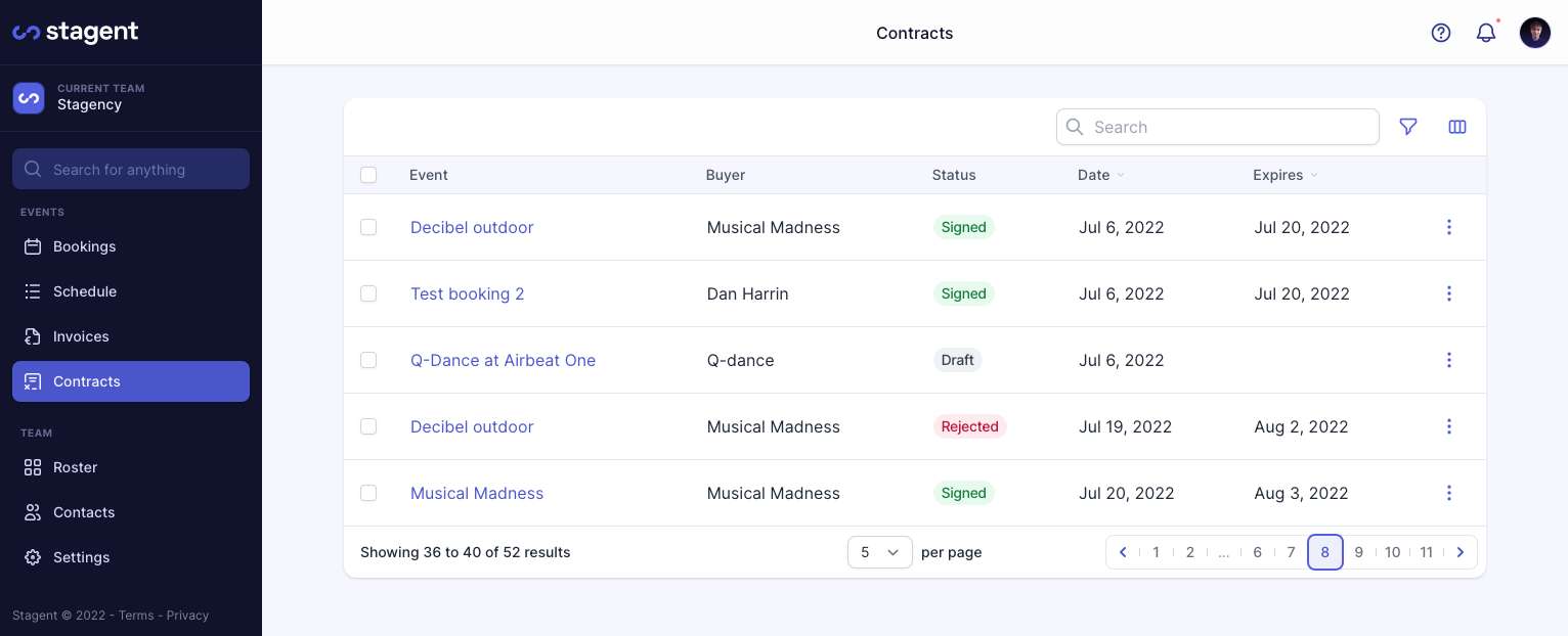
We’ve added two new dashboard views - Invoices and Contracts. The Invoice view will show an overview of all invoices that are generated. Users will be able to manage all invoices and their payments from one place instead of having to go through each separate event or booking. The Contracts view will be your one stop shop to see all contracts and their statuses - much more convenient to follow-up on unsigned contracts. We've also included nifty filter & bulk options, In the next cycle we’ll add cool analytics too.

Schedule / Tour dashboard
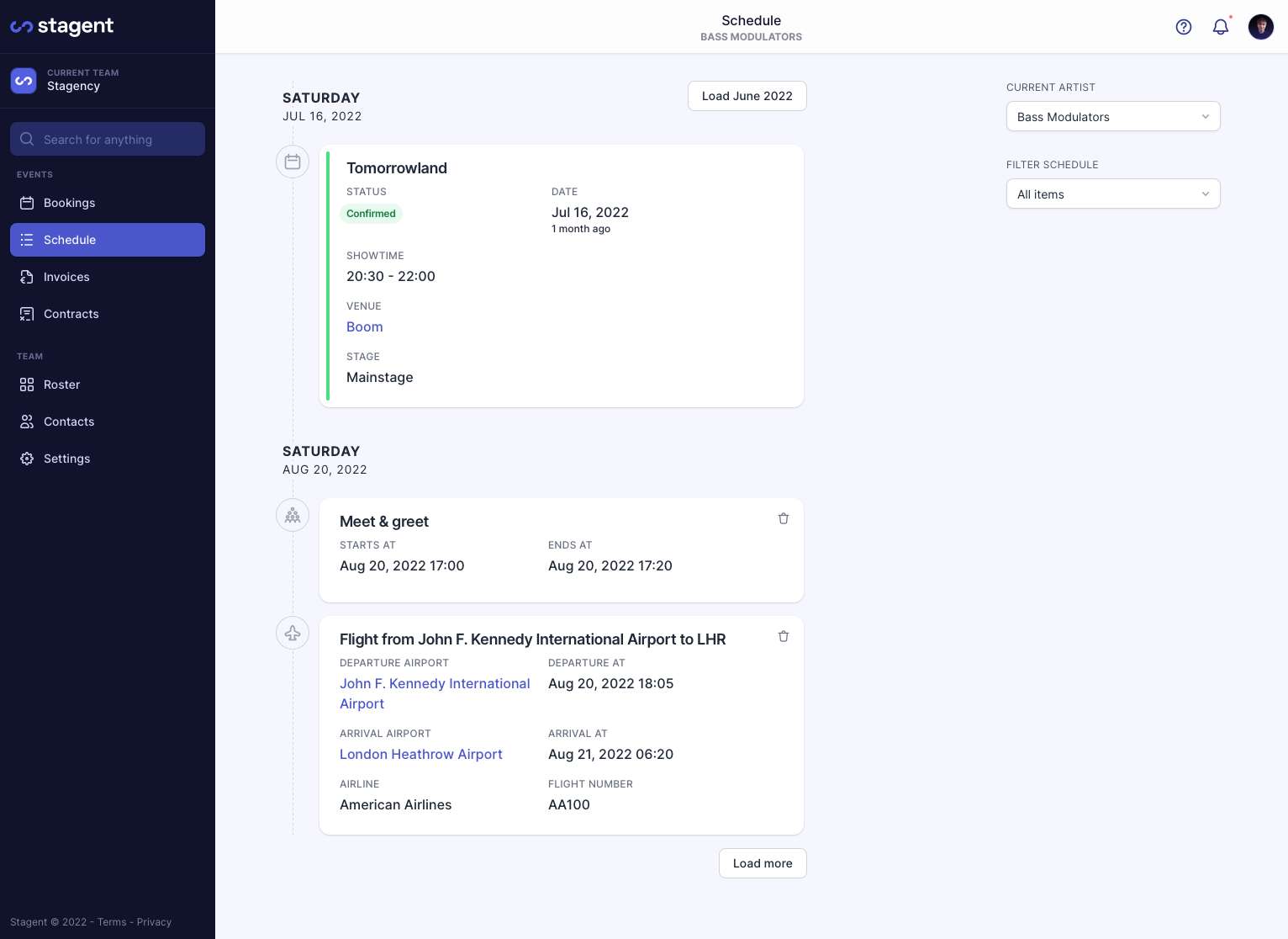
Artists now have a dedicated page for their full upcoming schedule with their travelling details and in-depth info. Agents will also have an overview of their artists’ entire tour schedule without visiting each of their events individually. This makes having a birds eye view of everything that’s happening incredibly easy.

Custom fields
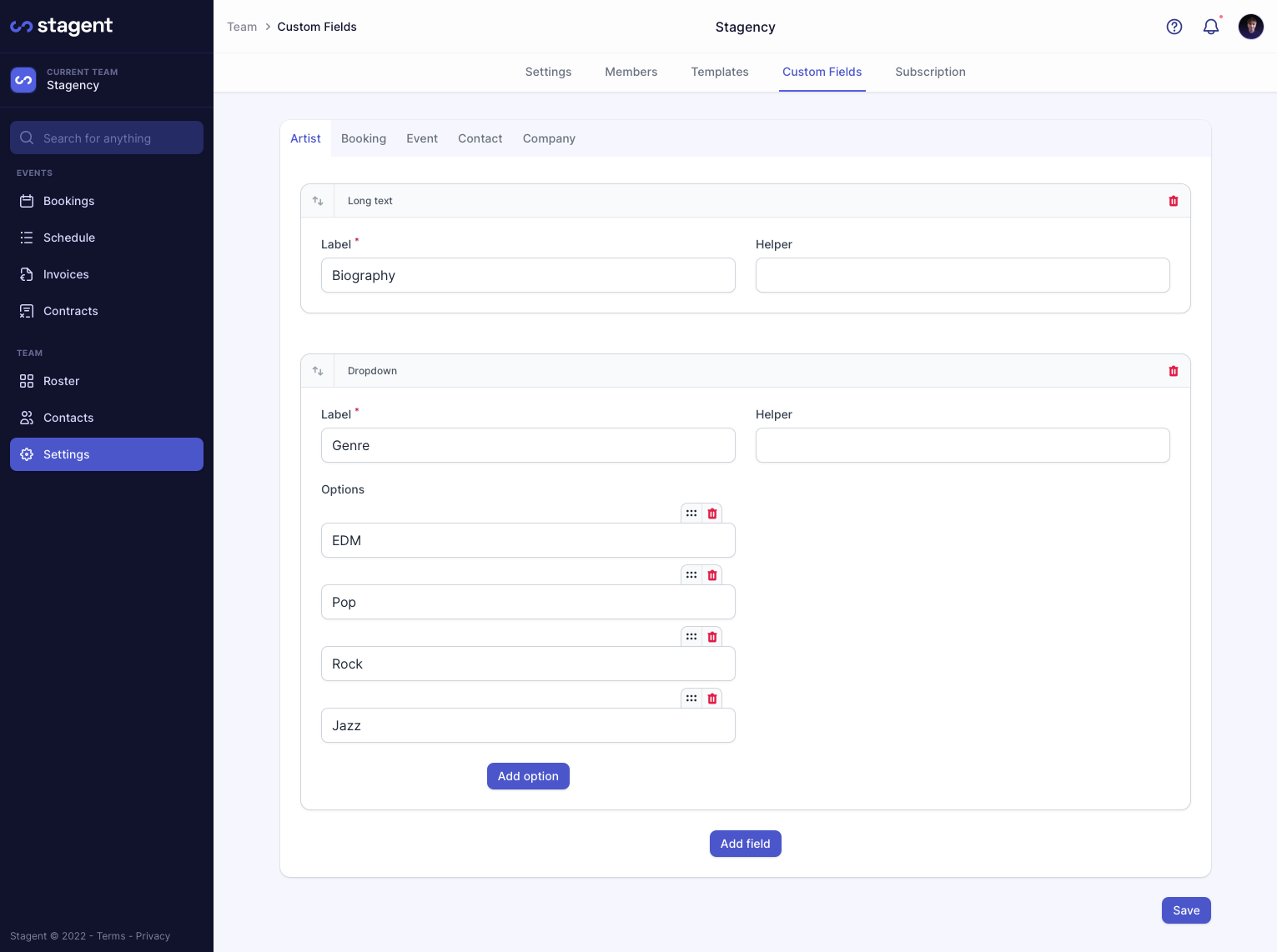
Users can add custom fields to artists, events, bookings, companies and people. With this option a user can add, for example, an event’s status or artist’s preferred airline, or other optional requirements to a booking. These custom fields will also be available through Zapier. By using custom fields, you’ll be able to personalise Stagent to work exactly how you need it to.

‘Into the night’ feature
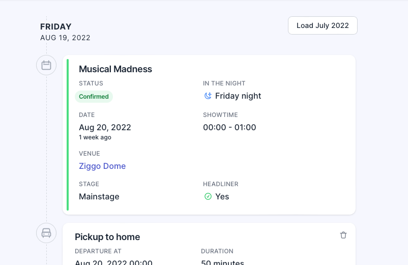
We now let you know on which night your artist performs, which is easier to understand as opposed to viewing dates in a standard fashion. Instead of 'performing on Saturday, August 20th at 0:00', Stagent will now say 'performing on Friday night, August 20th at 0:00'. For this feature we made days last 8 hours longer. So all bookings that have a showtime between 00:00 and 08:00, are shown as an 'In the Night' booking on the previous day. Say goodbye to double checking the dates on confusing time slots!

New design for contracts and invoices
We have a new design for our contracts and invoices which is structured and responsive for mobile. Previous formatting issues have been resolved. Contracts and invoices are now easier to read and can be conveniently sent at the click of a button.
Additional design updates
Our itinerary cards have received a small update to make sure that they display the most relevant information in the best way. The title of each card is now editable with a single click and the delete button is smaller and out of the way of the rest of the card’s content. For bookings, there’s now a coloured border in the app which is a great visual indicator to tell you the status at a glance. In addition, the navigator on the left is divided into two sections, events and team, to make it even more clear. With our new design updates, you’ll have a much cleaner and smoother experience.
Got any questions about our developments? Want to share some feedback? Or interested in scheduling an online demo? Click on the messenger button in the right bottom of this page and Mischa or Diederik will help you on your way.


